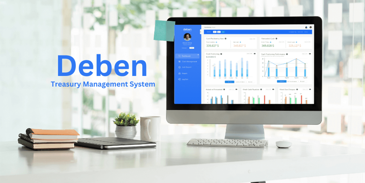
Empowering Financial Management: Redefining Treasury Systems with UX Innovation
Streamlines cash flow management for finance professionals.
$100K
Pre Seed investment secured
+30%
Revenue Growth
+20%
Cost Reduction
TL DR.
Deben used to struggle with providing their client with game-changer ideas and functionalities.
Our mission was to analyze the business and bring creative ideas to the product that would make it a game-changer in the industry.
Using our Human-centred design methodologies and techniques, we managed to put them around into the market and get recognized as a significant startup in the middle east fintech industry.

Deben won the first place venture competition from CIB. A bank is considered one of the largest financial institutions in the middle east.
Overview
Deben is a treasury management system specialized in helping the finance managers and Accountants to manage their cash flows. The system should provide the value for finance managers to avoid the hassle of daily paperwork to spot the account balances and provide them with tools to help finance managers do their job effectively
Project Scope:
Research, design and conceptualize the system for Deben
Design rationale:
The design concept focus on attracting the target users. concentrating on vibrant, techy and young accountants the concepts intend to be familiiar and desirable to these types of users
The Challenge
Deben is an up-and-running solution that provides the finance managers with their needs. Deben didn’t have significant specific functionalities that would provide crucial support to finance managers to make them buy Deben and need it crucially in their life.
Our mission was to find these game-changing features, prioritize them and add them to the concepts we provide for Deben while keeping the system usable and self-intuitive. Another thing was to research the correct fair pricing for the product.
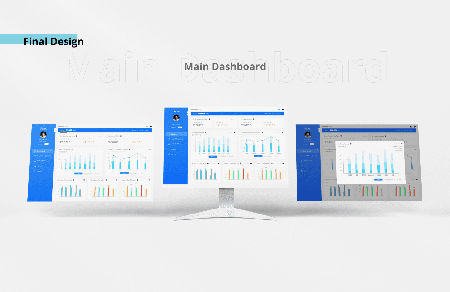
The Solution
We worked on understanding and analyzing the business opportunity. It was a key to study the need and stand on the value that Deben needs to provide for its customers.
The opportunity was huge, but there wasn't something specific that would tell what you needed to include to win the customers' delight. It was our mission to do so.
So, we've conducted direct user interviews with stakeholders from the targeted user groups.
We also conducted stakeholder interviews to align and understand the vision of the business. Then, review what they value from their point of view.
Right after, we did a deep competitor market analysis to understand how competitors provide solutions for their users, what type of users they are targeting and how they deal with them. Along with analyzing each competitive edge each one of them has.
Design Process


Wireframes

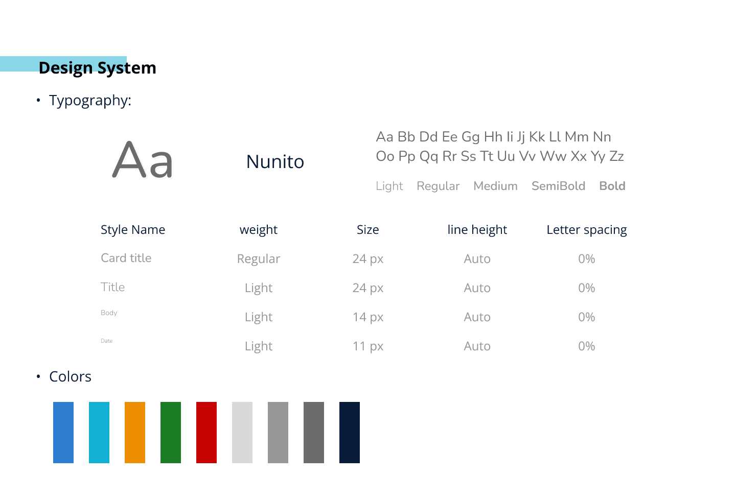
Design System

The Discovering stage
In order to understand the problems that would face the business we conducted stakholders’ interviews with Different business partners to stand on their point of view to the business. In order to understand and discover the problem, we’ve conducted some user experienece methods to discover and understand the perspectives of the problem. We’ve conducted:
Stakehoders interviews, to understand the problems facing the business from all of its perspectives. and to understand the SMEs point of view on their problems as well.
User interviews, We’ve asked the business to set us to meet sample of our users to understand the frustrations they face and the amibitions
they seek. we’ve continued conducting interviews in later stages to clarfiy our user groups & personas.
Quantitative user analytics, we’ve analyzed the data to understand the user behaviour, tendencies, differentiators and interests.
This helped us strategize our moves and understand more how to serve the user in the best way.
Exploring
Furtherly, we’ve conducted more methods to deep exploring the problems and define it. we evaluated the current user interface implementation to stand on the major UI problems and how it affects the user by going through the following:
Heursitic evaluation, We’ve deeply reviewed the current applications according to the main UI herustics and build a complete report with all the problems
Usability testing, conducting usability testing to stand on the usability of the app and the crucial points the users usually stock on inside the main pages and the checkout flow.
Conginitive walkthrough, especially to the check out flow to analyze the crucial problems that might face the users along with evaluating better solutions to the current flow
User behaviour analysis, Through monitoring user recorded sessions, we’ve explored problems that are facing the users and we could spot the most frustrating issues facing them
The Findings
Following up on all the details, we’ve concluded main problems facing the user and the business that are blocking the users from engaing with the applications. following are the most curical problmes we’ve found:
Fatal UI Issues, The current user iterface has some fatal UI issues that are blocking the users from finding crucial information and engage with the call to actions
User experience issues, as Deben's type of product need specific type of UX solutions that were not implemented by then. As the lack of trust of the users into the company. As the concept doesn’t provide any components building trust or follow pursuasive design concepts. Another thing, the browsing experience were not providing the users with the tactile nature of the product. This is what we’ve spotted to work on to get the user more closer to the product
Technology strategy, Based on our research we’ve concluded that some of the technology decisions needed to be handled in a different way to achieve better result with less effort
Design orientation Strategy, By that time, the implementation were focusing on platforms that were not used by most of the users. This meant that they were design solutions for users that they didn’t exist most of the time. By changing the solutions to be mobile first and mobile oriented. the design solutions changed dramatically
Design / Ideate
Design solutions
The elegance of design and how we changed the design from design full of unsuitable colors too and didn’t comfortable to the eye to designing elegant by using 2 colors black to reflect the elegancy and the vibrant colors to reflect the Young persona of the techie Accountant who use the app, changing the sharpness of the icons to be more smooth and streamlined, change the Direction of the image to be more realistic and familiar to the user not only just model in posters, also the models positions to get a sense of beauty